The University of Denver’s Marketing and Communications Division is deep into a year-long process of an overall University rebranding change and, according to our sources familiar with the process, DU’s upcoming decisions on this effort may directly and potentially adversely affect DU’s most visible part of athletic branding – the logos of DU’s Pioneer athletic programs.
Traditions are a big part of the Pioneer brand and managing the visual identity of that brand – the logos, colors, and images cast into the marketplace – is a key tool to help to drive choice and loyalty via identification, differentiation, and emotional connection.
The University of Denver, broadly speaking, has a love/hate relationship with its own traditions, with a long history of identity-related mistakes over the last 25 years. Our hope is that the senior University administration doesn’t make yet another mistake.
So here’s the situation, as far as we know it today – it’s a bit complex, so bear with us:
One of the key deliverables of this rebranding effort is a new university-wide logo that will, at the very least, replace the “DU Shield” (pictured below) that has been the University’s primary overall logo/mark since 2012.

University logos typically tend to get refreshed every 10 years (or so) and DU now wants a more “inclusive” logo, which now, as opposed to 2012, apparently doesn’t include shields.
Few of our fans and readers will likely mourn its demise, as the shield logo has very little to do with DU athletics, although there are a few places where Athletics has used it, including the women’s lacrosse practice jerseys, and Magnus Chrona, DU’s hockey goalie has employed the DU shield prominently among the artwork on his goalie’s mask.
To replace the shield, several new University-wide logo alternatives are currently being tested in focus groups with key audiences. DU’s plans are to likely launch a new/refreshed brand identity this spring, once refinements and approvals are completed. Unlike the last two overall University re-brandings (in 1998 and 2012), preliminary tested concepts have included sample logo design applications on DU athletic uniforms, raising concerns that the new logo may also be applied to athletics, and not just to academic items like the previous branding updates. This might mean that the University’s Marketing and Communications Division may wish to unilaterally impose the new logo on DU Athletics once the new logo is launched.
Historically, branding decisions that concern DU Athletics have been a mixed bag. The Chancellor and the Board of Trustees have wielded decision-making power on some athletic-related brand elements, such as the school nicknames and mascots, while the athletic department has always designed, managed, and deployed its own logos and uniforms.
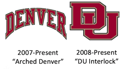
As for DU Athletic logos, there are two currently in use that were officially developed by DU Athletics in 2007/2008 – the “Arched Denver” and the “DU Interlock” letters:
 Both of these DU athletic logos have far deeper roots in DU history, however. The interlocking “DU” letters have a history on uniforms going back to at least 1910, and in print contexts dating at least to 1935:

The ‘Arched Denver’ has its own visual roots/DNA in Denver’s basketball and hockey jerseys, dating at least to the 1940s and 1950s, respectively:


Most colleges and universities would kill for that level of athletic tradition.
We know something about the new overall University logo designs that DU’s Marketing and Communications Division are testing/considering, and some of them are clearly updated versions of the interlocking DU letters, showing that DU’s branding firm understands the inherent basic value behind the DU interlock. But other proposed logo choices are entirely new and not based on anything in the current DU visual lexicon.
Our best hope is that whatever changes are made to the overall logo, the University will allow DU Athletics to retain control of its own athletic branding, which is the route that successful major universities follow.
The primary reason for keeping athletic branding separated from all-university applications is that the most successful athletic brands are highly-visible, simple, and differentiated – as they appear in direct competition with other college brands every day. They must also leverage tradition. Since the athletes change every four years (or fewer these days), the best college athletic logos tend to be tradition-laden, built on the deep heritage that came before in order to appeal and connect generations of fans to that history, like the “Block M” logo at Michigan or the script “UCLA.”. They are typically backward-looking, nostalgic, and collegiate in style, rather than forward-looking, trendy and non-collegiate.
There is a middle ground solution where DU could choose a new interlocking DU logo. That way, all of DU can at least unify around a proven logo concept – the DU Interlock. Our current issue with the proposed middle ground designs is that most of the new interlock designs are less “collegiate”, and don’t convey the athletic strength of the current DU interlock logo.
But our worst fear is that DU’s central administration will choose a different overall logo direction that isn’t based on the interlocking letters, and shove this entirely new non-athletic logo down DU athletics’ collective throats, effectively killing DU’s own successful athletic branding in the process.
DU’s athletic division is a, if not the jewel in DU’s crown, and has more nationally high-performing units and more national visibility than any other unit at the University. Such a division needs and deserves autonomy to guide its own brand future.
So, DU, go ahead and replace the shield (please), but don’t mess with DU athletics!
Go Pios!
The shield never really took off. Not sure that is a big loss for DU. I do like the arched DENVER and the interlocking DU is timeless. If they do some variation on the interlocking DU while retaining some traditional lettering fonts, I am good with it.
At the time the shield was created in 2012, the overall DU logo was a red abstract “D” that looked very corporate – as you would expect from the Dan Richie era back when it was created in the late ’90s.
The 2012 DU shield tried to inject some Ivy-style prestige into DU (All the Ivy league have heraldic shield logos that are derived from middle ages heraldry/Oxford/ Cambridge etc.). You can argue whether that was successful or not, but it certainly tried to be exclusive (perhaps to help justify what DU must charge) and not very ‘inclusive’, which is probably the big reason why DU is getting rid of it…
Given DU’s past track record, I am worried that they will screw it up…
Also, there’s no mention of Pioneers in the arena except for a sign for Athletics’ website: denverpioneers.com.
Dunker here to comment on arched DENVER. it’s fine on athletic uniforms worn in games. BUT, and a big BUT, it’s awful as a Stand Alone that students and fans purchase. I live in NJ. I wore a stand alone mask and sweatshirt last week with the Arched Denver on it and nothing else.2 people came up to me and said “I guess you like the city of Denver”. Nobody knows it’s DU. However, if it had read Arched DENVER with an associated name like Hockey or Alumni, people would know who the wearer represents.
I had the same experience as Dunker. DU sent me a beautiful Covid mask thanking me for my donations. It simply had the Arched Denver. People think I bought it in the city of Denver. The arch is cool on sports uniforms; we know what sport the athlete is playing. Our coaches wear sharp fleece 1/3 zip pullovers with Arched Denver and the sport underneath in smaller letters. I want one of them.
Dunker again. I buy lots of clothing from the bookstore. Never do I purchase something with just the SHIELD. It looks like something from a Catholic prep school.
Dunker- You can actually sign in as Dunker. Just sayin……
3rd world problems…
As long as they don’t mess with our nic Pioneer— also Pios I’m willing to see what they come up with and then react.
P.S. See you all at the Frozen Four here in Boston this year. The Pios WILL be there Go Pios
The red-tailed hawk? Boone? A meaningless shield? Absolutely no question the DU administration will screw it up again.
Hahaha, an inclusive logo. The interlocking letters were probably racist. Any time DU mentions the word inclusive, expect a laughable debacle.
Speaking of DU clothing and apparel, I would like to see a total revamp of all the shirts, caps, etc., etc. Most of it is just plain UGLY! We also need to see more athletic team branded clothing in ash gray as that, in itself, denotes athletics! While we’re at it, several more choices of hockey related clothing is also warranted.