
Would the LA Dodgers baseball team ever willingly jettison their famous lettering on their uniform chest?
Two words: Hell. No.
But that’s exactly what the University of Denver administration has reportedly asked its own National Champion hockey team to do for next season.
The sacred ‘arched’ Denver city/school name that has adorned the chests of the DU Pioneers’ hockey (and other DU sports) uniforms in various forms for more than 70 years (as seen below) – a jersey recently called “iconic” by ESPN – may very well die a terrible and completely unwarranted death from the university-wide logo change announced last month.
It is the first time in recent memory that DU’s central administration has forced a university-wide brand change onto its own athletic uniforms, as DU Athletics has controlled its own athletic branding on school uniforms for at least the last 40 years, and likely far longer.
At LetsGoDU, we warned DU fans about this possibility last February, and now our warnings appear to sadly have come to be. Recent conversations with some fuming DU athletics staffers at the 2022 DU Hockey banquet have confirmed that they have been told by DU senior administration that the familiar “Arched Denver” (the most recent version was created in 2007) must be jettisoned to make way for the new DU university logo. DU created an air cover for this move by sending this letter to DU ticket holders last month.

DU fans should be angry if this new University logo (above) is elevated as the primary sports jersey identifier for three major reasons:
TRADITION-KILLING: It destroys many generations of school tradition, identification, brand value, and collective memory of the current athletic marks and their similar predecessors.
CONFUSING: If the new interlocking logo is applied as a primary logo without the city name – “Denver”, it slices off the most tangible and visible unity link between our city name and our school name, thus further distancing our community from our school. Our school is mostly known as “Denver” in the college sports world, and carrying the city’s name isn’t just a pride issue, it’s also our geographic identifier. Today, “DU” is seen as a secondary reference that is well known locally, but far less so out of our region. Using the letters “DU” alone as the only logo may cause potential national confusion with other NCAA Division I schools – both direct “DU” users such as DePaul University, Drake University, Drexel University, Duke University, and Duquesne University, as well as schools that use the “D” and “U” letters in the “University of” format – the University of Dayton, the University of Delaware and the University of Detroit-Mercy.
TRUST-ERODING: This move will further erode trust in university leadership, as this change has been forced down the throats of DU Athletics by DU’s central university administration. This diktat arrives on the heels of the senior administration’s ill-fated 2018 behind-the-scenes attempt to take away the Pioneer nickname. Fortunately, all of the DU administrative leaders who we identified as pushing for that terrible result are now no longer at DU in key roles. If this DU logo becomes the primary identifier, it would be the latest in a long line of identity-related screw-ups since 1998 that we’ve recapped here over the years.
“Putting this new interlocking logo as the primary identifying uniform element would be a massive mistake,” says LetsGoDU Managing Editor Nick Tremaroli. “We can’t lose our vital link to the word “Denver” as that’s our hometown and school name, and to see it replaced by generic and confusing “DU” letters would be a lost opportunity on our most public-facing brand touchpoint – sports. DU Athletics is the ‘front-porch’ of our school.”
Indeed, there are three great visual traditions that link 70+ years of Denver hockey teams together – the Pioneer nickname, the Crimson and Gold colors, and the traditional graphic structure of the DU hockey uniform, with the word “Denver” spelled proudly across the chest. This hockey tradition has also been applied to DU’s other sports uniforms. These three elements, to DU fans, are sacred and they should be protected.
As you can see in these photos below spanning 70 years, the uniform designs may change, but ‘Denver’ across the chest is always there:


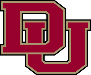
The new (2022) DU logo interlock (above) is an updated, more modern (and less collegiate) version of the 2008 “interlocking DU” logo that is now seen on the current hockey uniform shoulder sleeve:
 While we like that DU sees value in using an (updated) athletic mark by elevating it to a University mark, the new logo’s big, glaring weakness is that, on its own, it lacks context when seen without the word “Denver”. For example, if you wear a golf shirt with just the interlock logo in a U.S. airport outside of Denver, someone will come to you and invariably confuse this logo with either Oklahoma University’s famous “OU” interlock (especially when wearing it on a red shirt) or may try to guess which of the eight other D-I schools uses the “D” and “U” letters. That’s why it needs to remain a secondary identifier.
Why is DU doing this?
Back in 2012, DU introduced its current overall university logo, the DU shield (below). Ten years ago, DU was trying to elevate its prestige, as all Ivy League schools and many other US private colleges use heraldic shields to communicate prestige and authority.

“The…distinctive shield, will more clearly identify and differentiate the University as a prestigious academic institution which provides inspiration from our geographic setting as well as strength and endurance from our history,” said Kevin Carroll in a 2012 DU Press Release, back when he was DU’s Vice Chancellor for Communications and overseeing DU’s previous logo development. That shield logo was not imposed on athletics.
In 2022, DU is clearly trying to move away from elitism toward a more “inclusive” future, and they likely see the new interlocking DU as representing a more approachable style.
The University of Denver Vice-Chancellor for Communications Renea Morris attempted to justify the use of the new logo for Athletics in a Dec. 8th, 2021 internal letter saying “this work is intended to increase the visibility of the brand to aid in revenue generation and recruitment activities. With marketing buys split across the institution and critical but limited athletics visibility, unifying our marks will allow us to leverage and gain the benefit of every interaction and experience audiences have with our brand as we move into new markets and engage new audiences.”
While one could applaud such brand thinking, it has a fatal flaw. DU sports teams – the university’s single most visible piece of marketing – are seen online, on TV, and in newspapers across the country and beyond. Without the word ‘Denver’, the school loses the opportunity to make itself identified and noticed. Rather than viewers and readers seeing an identifiable team from an identifiable place, they will see simply a random sports team with a confusing logo. Thus, DU loses brand impact every time the Denver name is missing. The school, which has sought to make itself nationally and internationally relevant, will lose its brand presence. DU quite simply cannot afford that.
Indeed, in the world of Division I college athletics, unified brands, (where the university and the sports teams use the same logo) are still very much in the minority – perhaps for this very reason.
For example, in the BIG EAST Conference, DU’s lacrosse affiliation, only Xavier uses the same brand for athletics and university purposes (a big “X”) and still uses the word ‘Xavier’ on their uniforms. All other 10 Big East schools maintain different and separate logos for the University and for sports.
In the Summit League, only Omaha, Western Illinois, and St. Thomas have unified their athletic and university brands. In Omaha, this unified brand includes the name “Omaha.” Western Illinois and St. Thomas continue to use either place names or team nicknames on their uniforms. The other seven Summit schools maintain separate sports brands.
In the NCHC, only Miami, St. Cloud, and most recently, Western Michigan, have adopted this unified logo strategy, and the recent results have gone very poorly for the Broncos. The other five NCHC schools maintain separate brands.
DU’s new sports uniform direction strategy will become evident with new hockey (and other DU sports) uniforms next fall. Let’s hope they heed our input before they make changes:
- Don’t lose the word “Denver” on the chest. Without that city word on the chest, we’re just one of eight other D-I schools that use the ‘D’ and ‘U’ letters. Update the font to match the new interlocking DU if you must, but do not, under any circumstances, lose the Arched Denver.
- If the new “interlocking DU” logo must now be used on Denver sports uniforms, use it in a secondary position on the shoulder or pant, not in the dominant position on the front. And if it must be on the front, make sure the city name is there, too. Below is a visual example of an interlocking letter logo used well, at Baylor University in Texas. As shown, the world “Baylor” is usually the prominent identifier on most of the uniforms and the interlocking “BU” letters are used on headgear (or on the pant leg) and not used as the primary identifier.

Don’t like DU’s senior administration messing with DU athletic uniforms?
We encourage you to (respectfully) let DU Vice Chancellor for Communications and Marketing Renea Morris know directly at Renea.Morris@du.edu
And please also share your thoughts with DU Chancellor Jeremy Haefner at chancellor@du.edu, and don’t forget to share your thoughts here in the comments below, too.
As a former DU athlete and alum, I completely agree with the take in this essay regarding the use of the new DU logo in athletics.
DU Administration: Please keep the arched “DENVER” on the front of uniforms. As mentioned in the essay, DU sports teams are known as Denver, not DU outside of Colorado.
Tradition in sports is very powerful and should be respected.
The look of the new logo is fine but it should be on the shoulder or pants of sports uniforms, not on the front as the sole identifier.
Thank you for your consideration.
Ken Reed
B.S.B.A. ’81
Baseball and Basketball
PLEASE, SAY IT ISN’T SO !!!!
This new logo is a travesty. I’ve been a fan since even before I was a student and putting this on jerseys in place of “Denver” just feels like a betrayal.
I’d encourage anyone with a strong opinion to also email the advancement department (advancement@du.edu) since they are in charge of alumni affairs.
Remember, you can be a fan of DU but not a fan of the administration and its decisions. I will always love DU, and we need people in charge that love it as much as we do.
Couldn’t have said it better! DU should definitely never change anything and be the same school it was in the golden years of the 1950s! Things always went perfectly under those past administrations. Gosh if only we could have them back and keep every logo, image, uniform, and bad decision that nearly led to multiple bankruptcies. Really those were the best years.
Pro Scientia – DU needs to make a ton of changes. Those changes need to be made south of Asbury. North of Asbury has performed as one of the top universities in the nation – both on the fields, ice, slopes and courts as well as the classroom. Work on the things that need to be fixed and leave things that are working alone – simple science.
Really beg to differ about improvements being sparse in the academic areas (“south of Asbury”). Recent R1, nearly $50M in research expenditures. Many faculty and student awards. Much more could be said. Certainly don’t want to take away from the great athletics performances, but frankly the athletic programs lose money like crazy. The visibility is worth something, but athletics isn’t the only place that comes from.
Not surprising…just another disappointing move from DU that will decrease visibility. No one is going to know what “DU” is when these coaches are out recruiting. But everyone knows who they are with a big arch “DENVER” across their chest.
Hard to get fired up about this until we can see some Jerseys & Uniforms. The logo sucks but who cares?
The decision to change the logo was approved by a Committee that included Karlton Creech, the outgoing AD. It was approved by the Chancellor & unanimously approved by the Board of Trustees.
These people don’t give a crap what the Alumni, fans & supporters of the school think. This is a university that imposed a “Mask Ban” on campus in 2018 for the sole purpose of keeping the Boone Mascot costume off campus. Then they lied to the Denver Post & the entire DU community saying the Mask Ban was designed to “prevent terrorism.”
Lest we forget, DU also whited out & erased a Boone sign held behind the players in the National Championship photo in a Twitter sent out by Chancellor Heffner in April & this month in the DU Alumni Magazine.
These people don’t care. Why should we care?
“Wearing Masks on campus effective Jan. 1, 2018
For the Safety of all DU community members & guests, persons may not wear masks which conceal the face on University premises, including but not limited to masks worn with the intent to or having the effect of threatening, or harassing any other person; avoiding identity while engaged in conduct prohibited by University policies or and law; or causing and persons to fear for their personal safety…blah, blah, blah…”
I hear ya, DG! Everybody is tired of fighting City Hall. But that’s how they roll – announcing changes in Spring when everyone’s thoughts are elsewhere, making the changes in Summer when everyone has left, and forcing us to live with it in the fall, when it is too late to change it.
I guess we do have a choice – we can roll over to the point that all of our traditions are eventually eliminated by people who don’t care about them, or we can speak up here, and hopefully they listen to reason and make appropriate changes.
My guess is that the DU people making this decision were told that making everything the same is a good thing. That’s the way branding was 15 years ago, when rigid master brands were sold as a panacea for money savings and convenience.
Today, smart organizations tweak and adjust elements of those master brands to meet specific audience, market or operational needs.
“A foolish consistency is the hobgoblin of little minds….”
–Ralph Waldo Emerson (Self-Reliance, 1841)
It looks like this is a done deal, so I will not utilize brain cycles on this.
Long article! Gotta save some of that energy for when you find out the PioneerWeb name is being retired
The solution is so simple. Put the new wiz-bang interlocking DU logos on the shoulders to support the new brand initiative. KEEP DENVER on the front. Do whatever you want with all the other uniforms. Why crush 70-80 years of brand value.
I agree. No change!!
#theimpactofbadbranding As a Graphic Designer for many years in NYC and a huge DU fan, former high school & College athlete I find this rebranding and social narrative a “Come up for air” moment, enough is enough. If you look at the visual history of the University of Denver, the various logos and team wear have progressed and have become stronger and much more graphic with the use of bold lines, shapes and forms, which have attributed to the success of the brand. There is a long history of College and University logos and the most successful ones all use a strong serif font and most importantly are badges of honor for all the Alumni and leverage and connect their target audience and generate loyalty among students. Please stop trying to erase history.
Nice! I don’t trust sans serif people at all!
University of Denver has pretty much no identity anymore. The effort to get rid of Boon and nearly Pioneers is emblematic of this. As someone living outside of Colorado I can tell you nobody will know what DU is…